logo design
Logo is a graphic
mark, emblem, or symbol commonly used by commercial enterprises, organizations,
and even individuals to aid and promote instant public recognition
Reference pictures
Reference drawings
CONCEPT AND IDEA DEVELOPMENT
DIGITAL
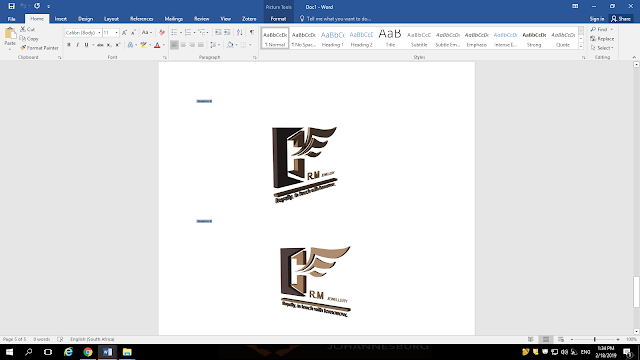
FINAL DESIGN
The O-shaped part of the logo represents an ingot mould
block. An ingot is a piece of relatively pure materials, usually metal, that is
cast into a shape suitable for further processing. In the steelmaking, it is
the first step among semi-finished casting product. The tribal lines of the
logo- which look like a wing of a bird- represent a melted metal that is being
poured inside the ingot mould. The font used in the logo is Century Gothic
which has a strong minimalistic personality, modelled by Monotype Imaging in
1991. The thick line that runs across the logo represents something that is
difficult to break.
It suggests strength and gives emphasis to the nearby
elements; it is bold and makes a statement. The line is also parallel to the
horizon and it suggests calm and quiet, a relaxed comfort.
The colour palette is limited, using the colours; light brown
and dark brown, adding significance to the minimalist style. The elements of
the logo are placed in a way that allows other elements of varying visual
weight to balance one another around a fulcrum point. It makes use of
approximate symmetry in which equivalent but not identical forms are arranged
around the fulcrum line. The relative size and scale of the various elements in
the logo design is (in some way) irregular. The spaces around and between the
logo elements form an abstract shape which is artistically relevant. The logo
design is active in a sense that it instils the sense of motion or activity in
the logo.


